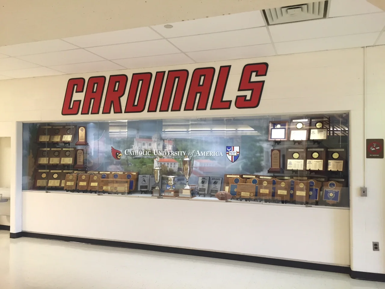
We do quite a bit of work with Catholic University's Athletics department, and they usually have some pretty fun projects. This time was no different: they had a drab looking trophy case that looked more at home in a high school instead of a nationally-renowned college athletics program.
The case as it existed before the transformation.
Their existing case was plain, and looked sparse despite the amount of awards displayed. They had the idea to produce a mural for the inside of the case, including the side walls. We pulled some photography together, settled on what logos needed to be displayed, and came up with a layout that livened up the wall yet kept it as a background. We did this by blurring the photos, and leaving the logos nice and crisp, making a clear distinction between the background and the foreground.
The final image for production.
The first step was to prep the case by clearing out the trophies, and cleaning the walls.
So plain...
We printed the image on our adhesive wall fabric, which is great for drywall application. Since it's fabric, it has no sheen or reflectivity, which ends up looking great.
Looking good, but it's not done yet.
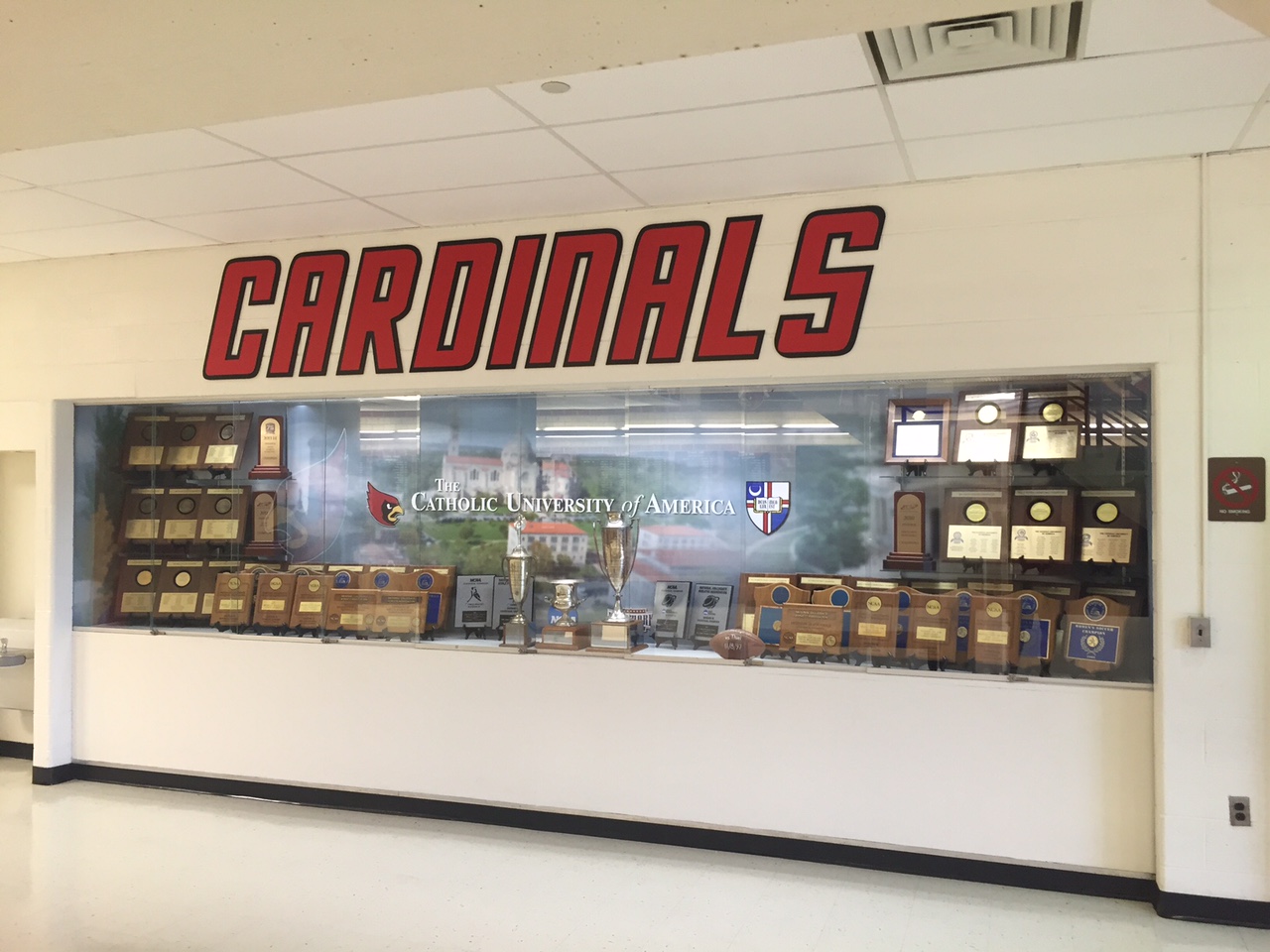
The graphics were just one part of this project - the other was how to re-populate the case, keeping in step with the look of the new mural. Patrick and his team did a great job doing that. Not only does the case look more alive, but it looks more collegiate and less high school.
Final transformed case. Looks fantastic!
The finished product looks great, and the CUA team took the opportunity to change the selection of trophies and awards that were displayed. Thanks to Patrick at CUA for the photos!


