When you think of signage, you might picture the flash-information of a yard sign in your neighborhood, with the names, addresses, and dates of the sale. You might also envision the simplistic and chic open/closed double-sided hanging sign of your favorite pizza shop. What you might not immediately visualize are the signs that hang directly above you that keep you sheltered from the sun, wind, and rain.
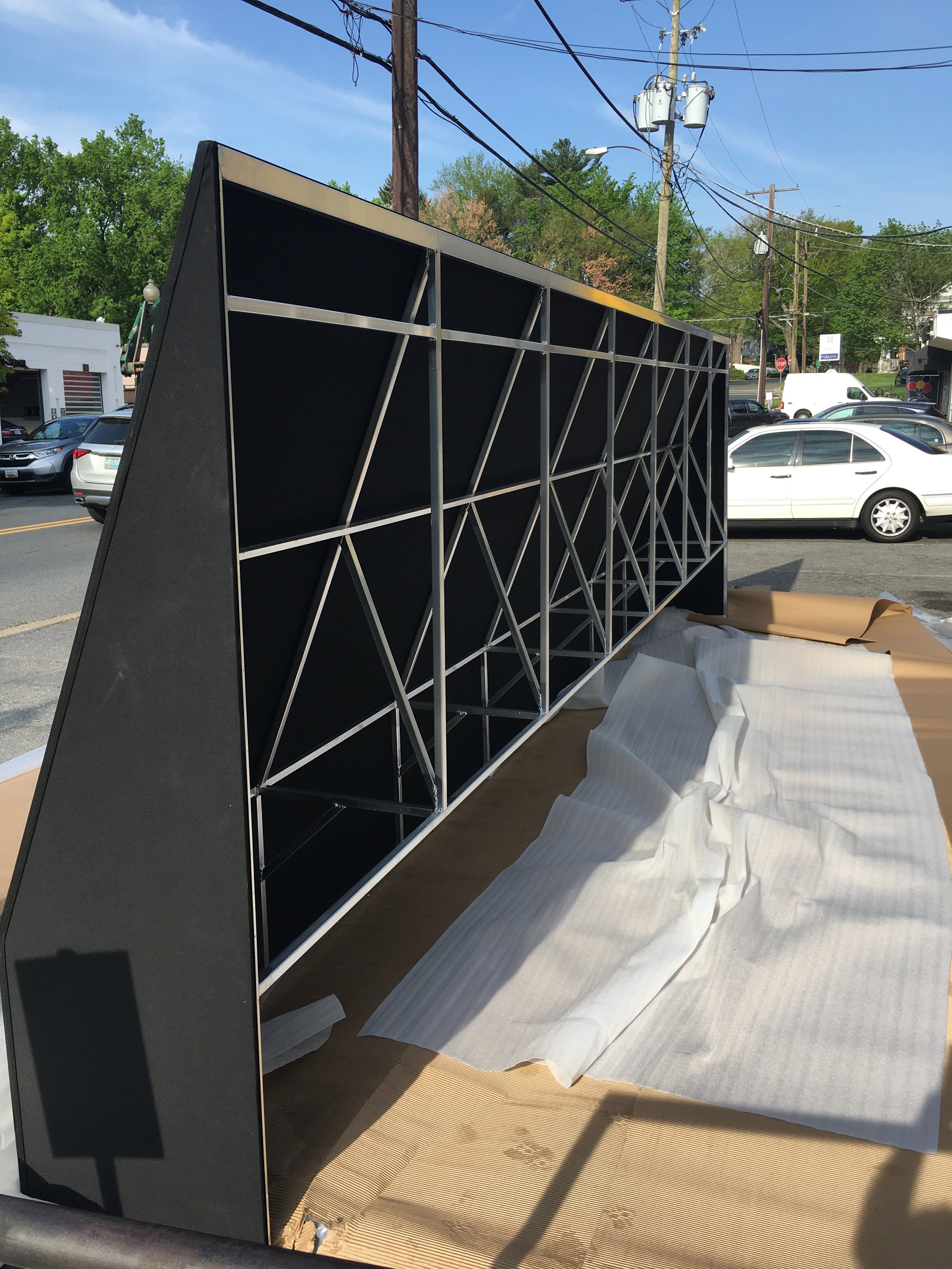
We’re talking awnings: those stylistic canopies that lend a hand in making sure you’re protected from the elements – and conveniently let you know which store you’re about to walk into. Not many people know about the awning service at Next Day Sign Express, but we’ve been crafting them for almost 20 years! Our process involves getting the site survey, measuring dimensions and desired outcomes, taking reference photos, designing the proposed awning both by itself for print and imagined superimposed on the references, engineering of the frame, and final installation of the awning. It may sound like a lot, but we’ve got you covered!
Their old awning
Their new store front, pre-painting
The new awnings
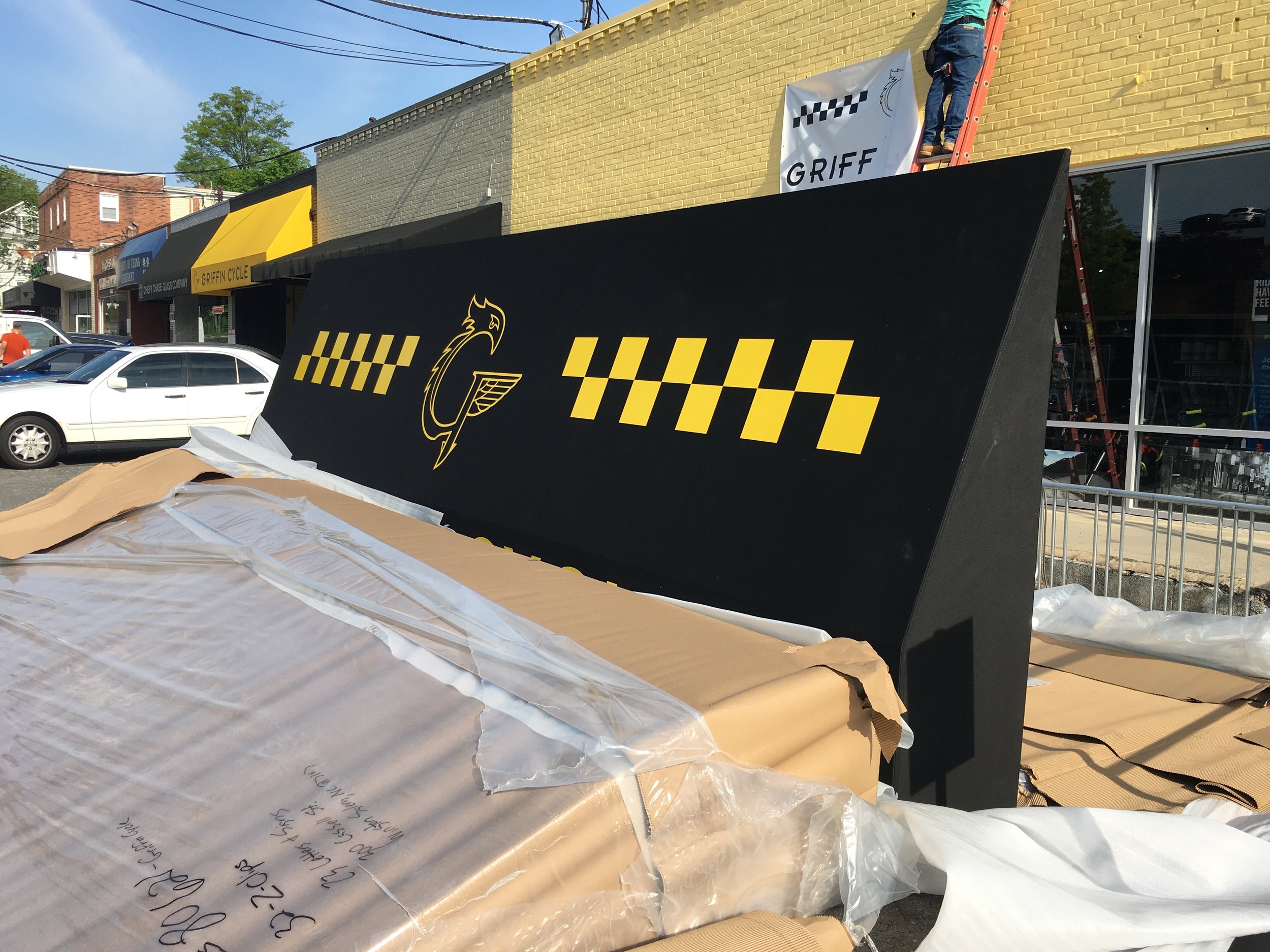
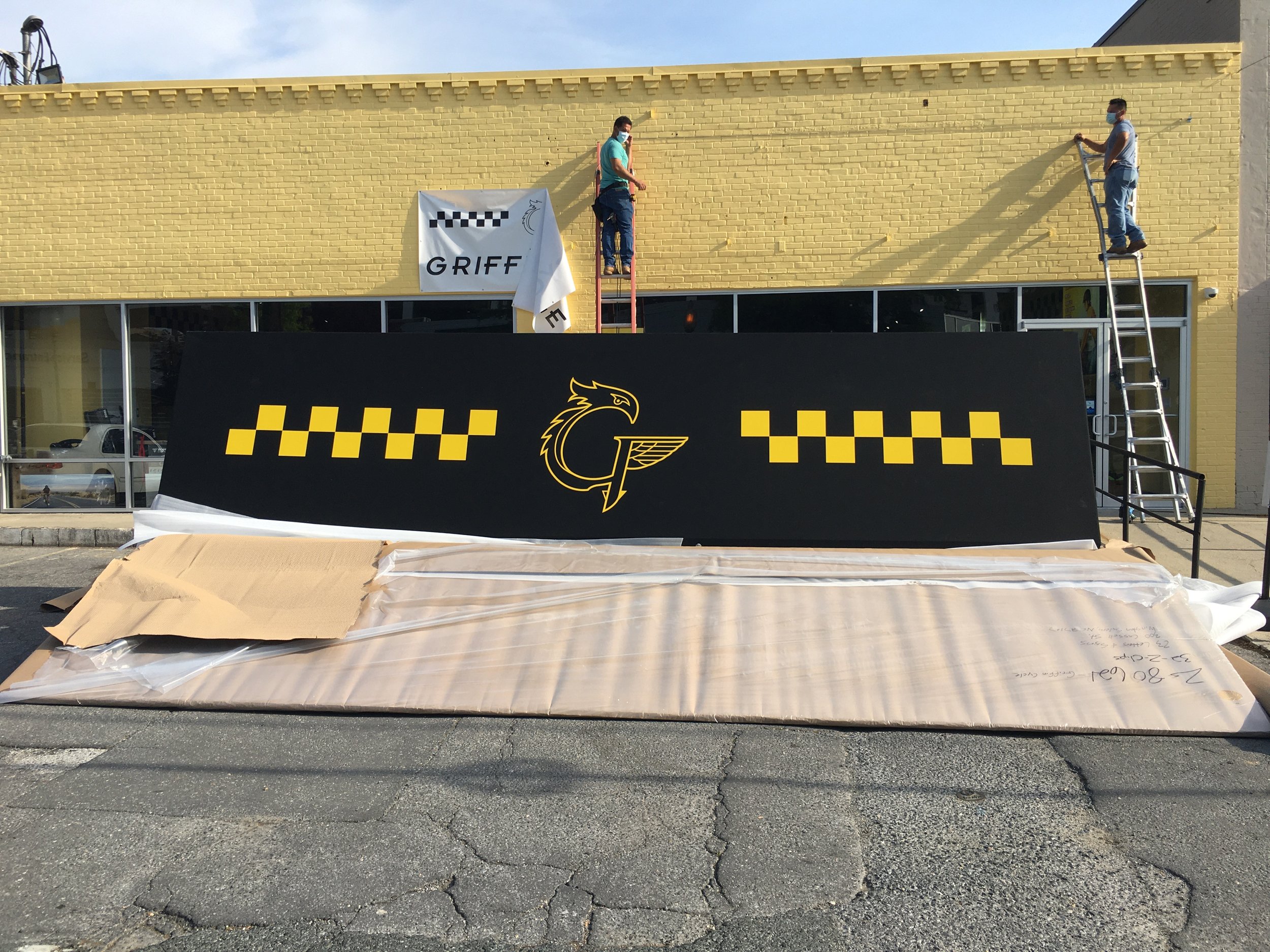
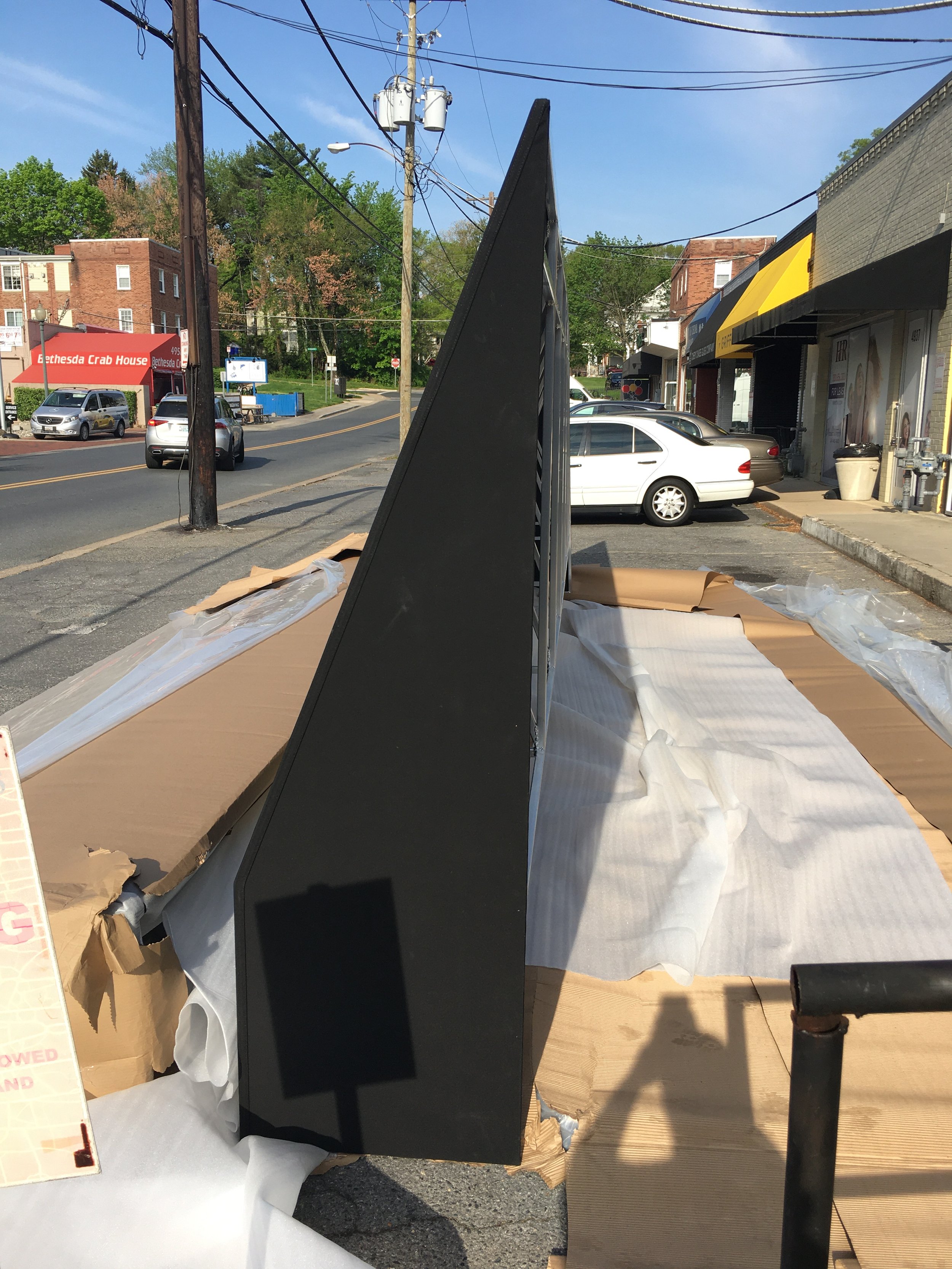
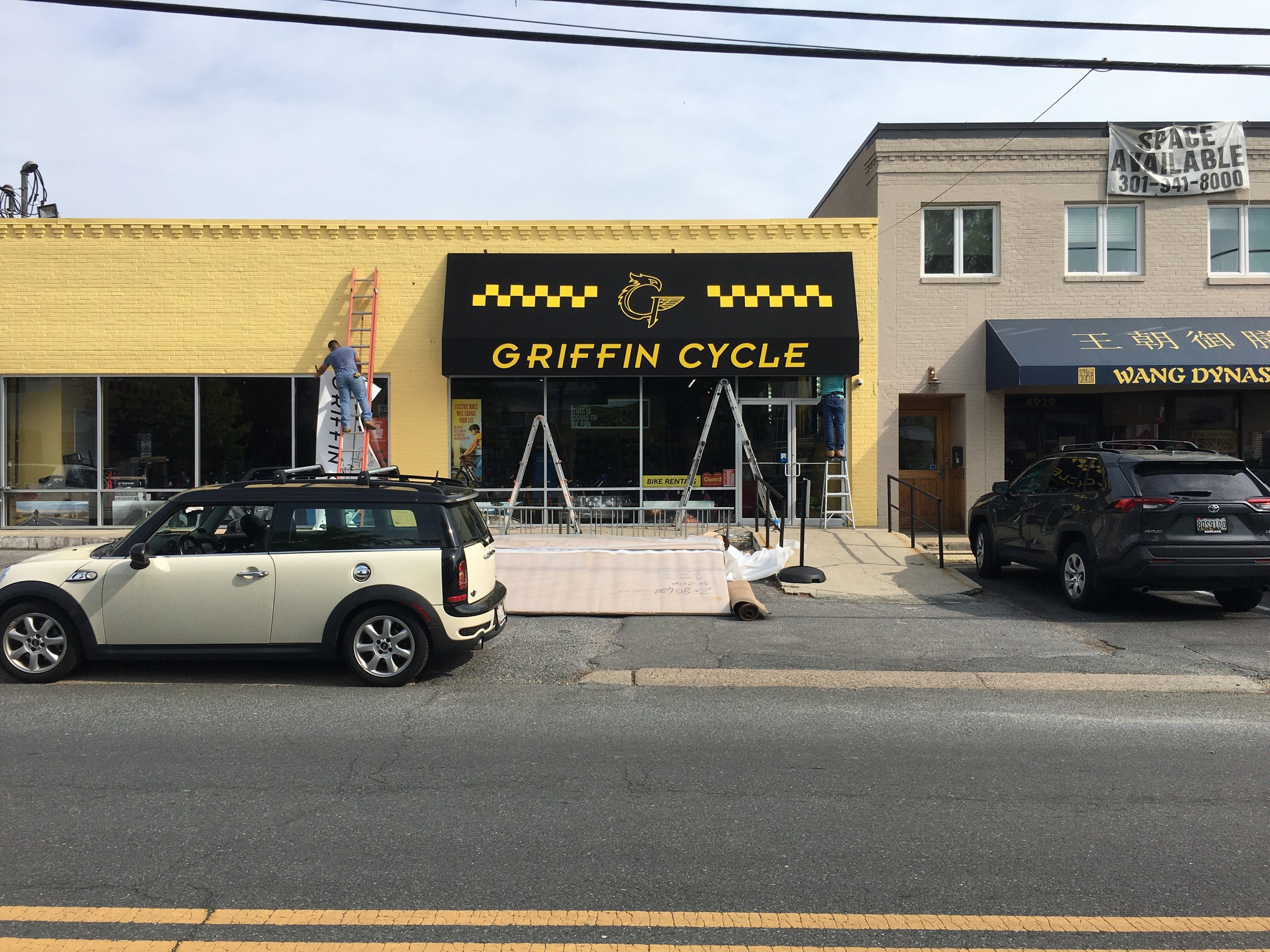
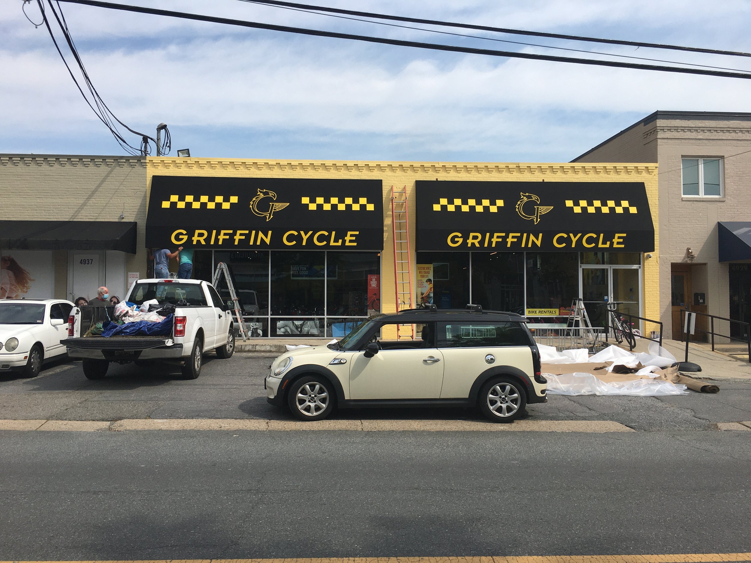
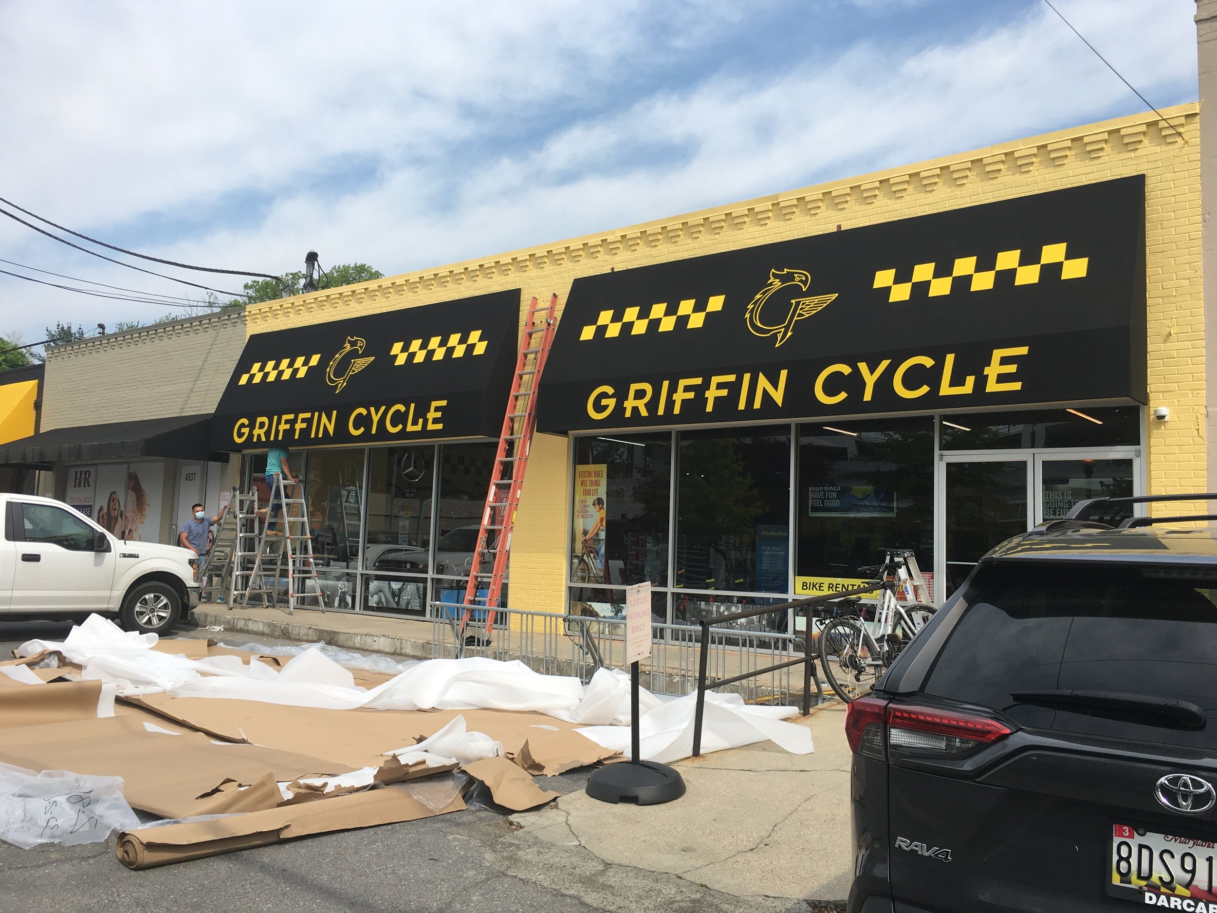
To give you a behind the scenes look, we took in-progress photos of our handiwork over at Griffin Cycles. When moving locations, they took the opportunity to refresh their look. It was the perfect time to do so! Trying to move one established awning to another location isn’t an easy task. The sizing and dimensions may be off for what is needed, and ultimately leads to a new awning needing to replace the ill-fitting old one.
We took a look at their previous awning to get an idea of where they were coming from, and to start generating those creative juices. The angle of the scrapped awning was incredibly deep, making projection near impossible for branding. It made for some pretty nice shade, but there was no real payoff for the sacrifice of advertising.
With gathered resources and knowledge in-hand, we set to work immediately! The first thing that had to change was the depth. Originally, the awning was at a whopping 40” deep. Adjusting it down to 24” was the perfect canvas for the upgraded design on the way. Impact and memorability were needed, so we swapped the yellow for black and the black for yellow, and we ended up with a sleek modern take on their classic look. We incorporated more of Griffin’s logos and designs on their website, and gave a cohesive look that communicated easily to their clients!
The new and regular customers at Griffin Cycles weren’t the only ones who were lured in with attractive awnings! Another redesign was taking place nearby, where they were altering their branding and identity and needed some awnings to go with it. Momolicious was inspired, and very quickly we were too!
Working with a flat-faced building would take some engineering pressures off, but we weren’t so lucky. There were bumps and contours we had to work in tandem with and compensate for that would allow the awning to look correct and still be functional. It was a fun challenge that got us working creatively both in a design sense and an engineering sense! We had to involve the help of some of our great manufacturing partners that made the process simple for us and the client, and allowed Momolicious to get their beautiful reopening!
The original awning
The new awning


